Get started with Siloh Theme
A Theme is a portable and self-contained package of developer assets designed to work together to enable a marketer-friendly content-editing experience. These assets might include templates, modules, CSS files, JavaScript files, images, and more.
1. Creating a Child Theme
By creating a child theme of the Marketplace theme, You can now create one-off changes, custom CSS, JavaScript, and/or modules, while still being able to receive updates through the Marketplace. You can create a child theme for your marketplace purchased theme or a default HubSpot theme in the Design Manager. When creating a child theme from these assets inside the Design Manager, the following files will be added to your child theme:
- theme.json - this will include the proper extended statement for linking to the parent theme.
- child.css and child.js - this is an empty CSS and JS file. Code added to these files will only affect the child theme. You can customize the name of these files in the advanced options section of the child theme creation wizard.
- In your HubSpot account, navigate to Content > Design Tools.
- In the left sidebar, navigate to @marketplace > Siloh and right-click on the theme and click Create child theme.
- Enter a name for your child theme, choose the location of the theme, and click Create Child Theme.
- Once your child theme is created, a success message will appear telling your child theme is ready to go. You can now click Close.
2. Theme Settings
To customize your theme's styling, including font, colors, and spacing, navigate to your theme settings. Any styles edited here will apply to all pages.
For any additional customization options needed in theme settings. Contact us at contact@nidish.com
Follow these steps:
- Click the settings icon in the main navigation bar of your HubSpot account.
- In the left sidebar menu, navigate to Content Themes.
- Select your Siloh-pro theme.
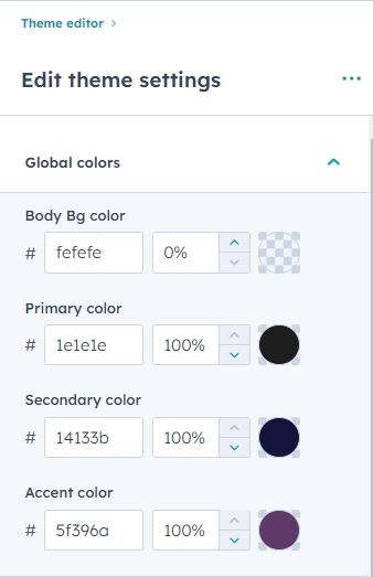
Global Colors
Here, you can customize and establish the colors that will represent your brand.
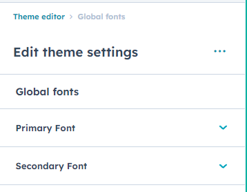
Global Fonts
Here, you can set up the typography for your site. You can choose the typography settings for Primary Font (Body Texts) & Secondary Font (Headings). You can choose the Primary font from any Google Fonts and Its Color in the Primary font settings. You can choose the Secondary font from any Google Fonts and Its Color in the Secondary font settings.
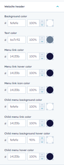
Website Header
In the Website Header Settings, You can choose the Background color of the Header, Text Color, Menu link color and It’s hover state color, Menu link dropdown icon color, Child menu Background Color, Child menu link color, Child Menu Item Link hover state color and it’s Background color on hover state.
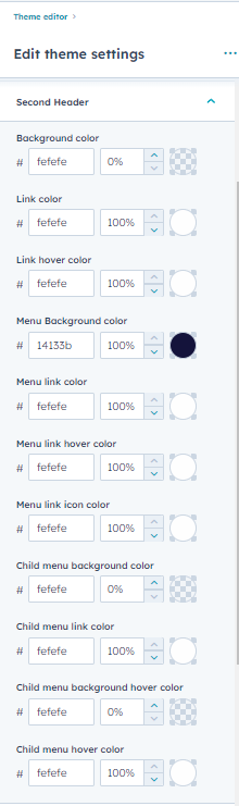
Second Header
Siloh has another variation of the Header. You can customize the Second variant Header Style in this theme setting. You can customize the Background color of Header, The Link color and its hover state color, Menu Background color, Menu link color and it’s hover state color, Menu link submenu dropdown icon color, Child Menu Background color and it’s hover state, Child menu link color and it’s hover state color.
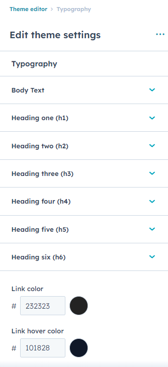
Typography
In this theme setting, You can customize the Typography settings of Body texts, Headings (H1- H6) and Link color & Link Hover color throughout the theme. In the Body Text Setting, You are provided with selecting the Google font of your need and font size, color, line height, font weight, and a boolean option to change the Font size on mobile if needed. SImilarly, you have the same options in Headings H1-H6.
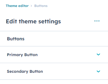
Buttons
In this theme setting, You can define the styles of the Primary & Secondary buttons used on the theme.
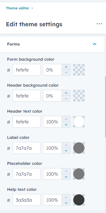
Forms
You can customize the form styling inside these settings. You can customize the Form background color, Field background color, Label color etc here.
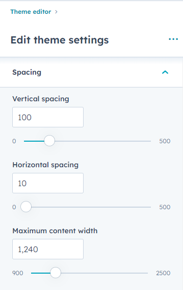
Spacing
You can customize the container width, Vertical & Horizontal Spacing globally here.
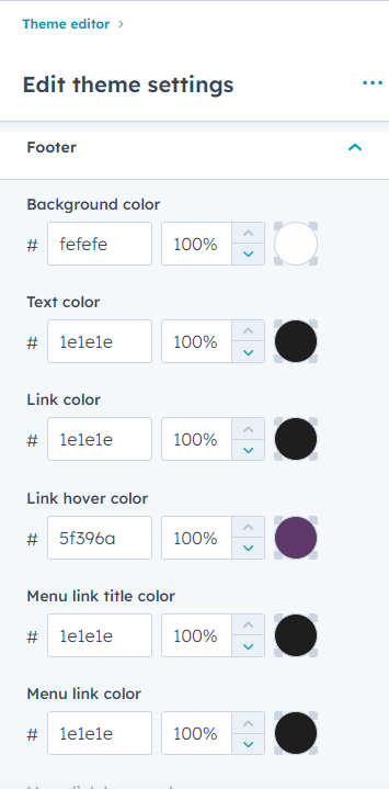
Footer
You can customize the footer settings in this setting.
3. Advanced Header
The Header module in HubSpot allows you to create a fully customizable and functional top navigation area for your website.
With the Header module, you can easily configure and manage essential elements such as navigation menus, branding, and user interaction features. It provides flexibility to match your website’s design and usability requirements.
- Add and customize a navigation menu, including support for mega menus.
- Include a search bar to help users quickly find content on your site.
- Display contact details such as phone number, email, or address.
- Enable dark/light theme toggle for enhanced user experience.
- Incorporate buttons, social media icons, logos, and other interactive elements.

4. Advanced Footer
The Advanced Footer module in HubSpot allows you to create a comprehensive and feature-rich footer section for your website.
With flexible layout options and customizable elements, you can organize important information, navigation links, and engagement features to enhance usability and brand presence.
- Display recent blog posts with featured images and links.
- Add grouped navigation links for quick access to key pages.
- Include your company logo with a customizable description.
- Integrate social media buttons to boost engagement.
- Show contact details, newsletter forms, and call-to-action buttons.
- Enable copyright text, secondary menus, and back-to-top functionality.

5. Page Templates
When you are creating a new page in HubSpot, you will have the option to choose from the available templates.
To access the available templates when creating a page in HubSpot, follow these steps:
- Log in to your HubSpot account and navigate to the Content menu.
- Find and click on the Website Pages or Landing Pages option.
- Click on the Create button to start creating a new page.
- In the page creation menu, you will find a section where you can select a template.
6. Blog Listing Template
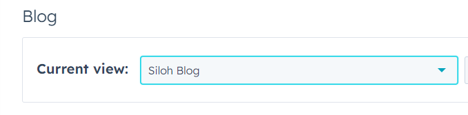
- Click the settings icon in the main navigation bar.
- In the left sidebar menu, navigate to Content > Blog.
- In the Current View section, click the first dropdown menu and select the blog you want to edit.
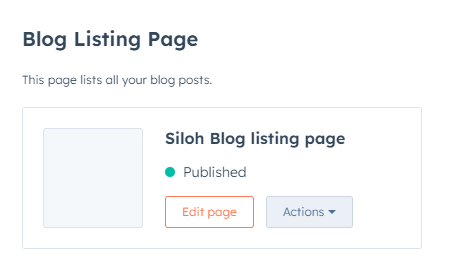
In the Blog Listing section, click the Actions dropdown menu to manage your blog post template:
- Select Change template to choose a different template. On the next screen screen scroll down a click Advanced options then select Use different template On the theme selection screen, choose Siloh Blog Listing Page, then select your Blog Listing then click Use Template.
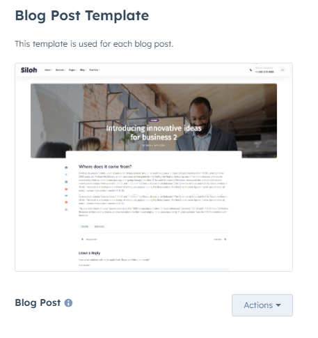
Blog Post Template
- Click the settings icon in the main navigation bar.
- In the left sidebar menu, navigate to Content > Blog.
-
In the Current View section, click the first dropdown menu and select a blog and select the blog you want to edit.
In the Blog Post section, click the Actions dropdown menu to manage your blog post template:
- Select Change template to choose a different template. On the theme selection screen, select Siloh, then select your Blog Post template then click Done. In the bottom left of your template settings, click Save.
7. System Templates
System Pages
- Click the settings icon in the main navigation bar.
- In the left sidebar menu, navigate to Content > Pages.
- Select System Pages from the tabs
- There you can select the templates for these system page:
- 404 Error page
- 500 Error page
- Password prompt page
- Search result page
- Also, you can set the Search result page URL.
Subscription Templates
- Click the settings icon in the main navigation bar.
- In the left sidebar menu, navigate to Marketing > Email.
- Select Subscription from the tabs
- There you can select the templates for these subscription pages:
- Subscription preferences page
- Subscription Update Confirmation page
- Unsubscribe page
8. Module
Apart from the theme settings, we provide advanced customization and content updation options in custom & global modules.
For any additional custom modules or customization needed in modules in the Siloh theme. Contact us at contact@nidish.com
Module Content Updation
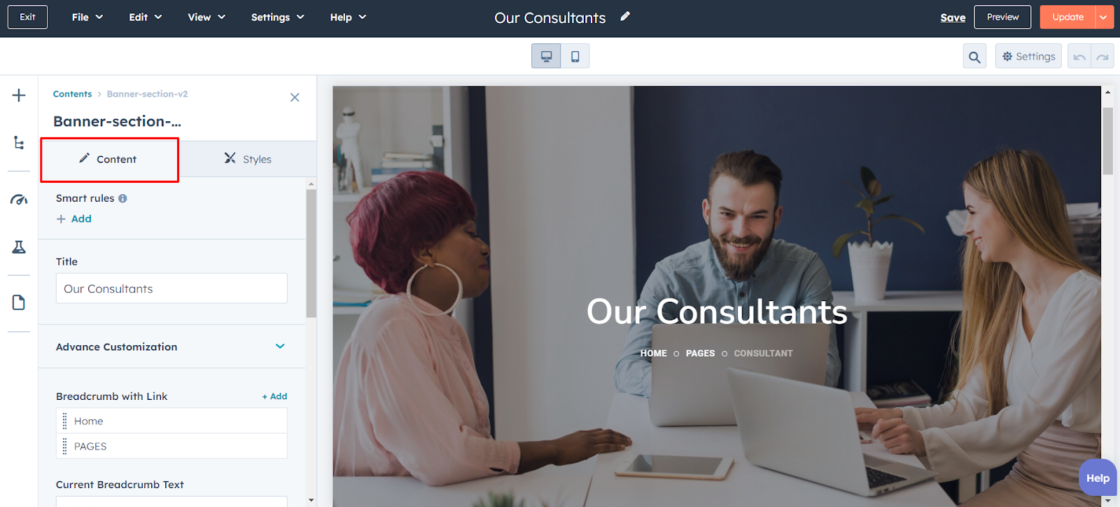
Inside the edit page of a particular page, You can just click on a module and click on the content tab to update the Text, images, and other elements of the module.
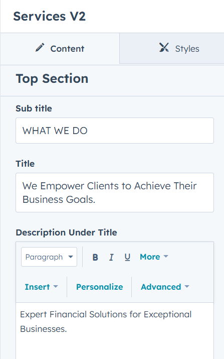
Some of the Module support additional settings such as:
1. Top sectionHere you can add or remove the module's heading, such as titles, descriptions, or buttons.
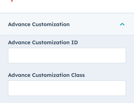
 2. Advance Customization
In this field you can add own additional ID and class for custom styling.
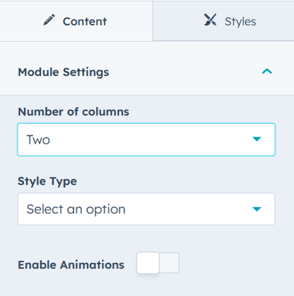
 3. Module Settings
Field settings vary across modules. In the image below, this module contains three settings: number of columns, style type, and animation, which you will find in most modules.
Module Style Updation
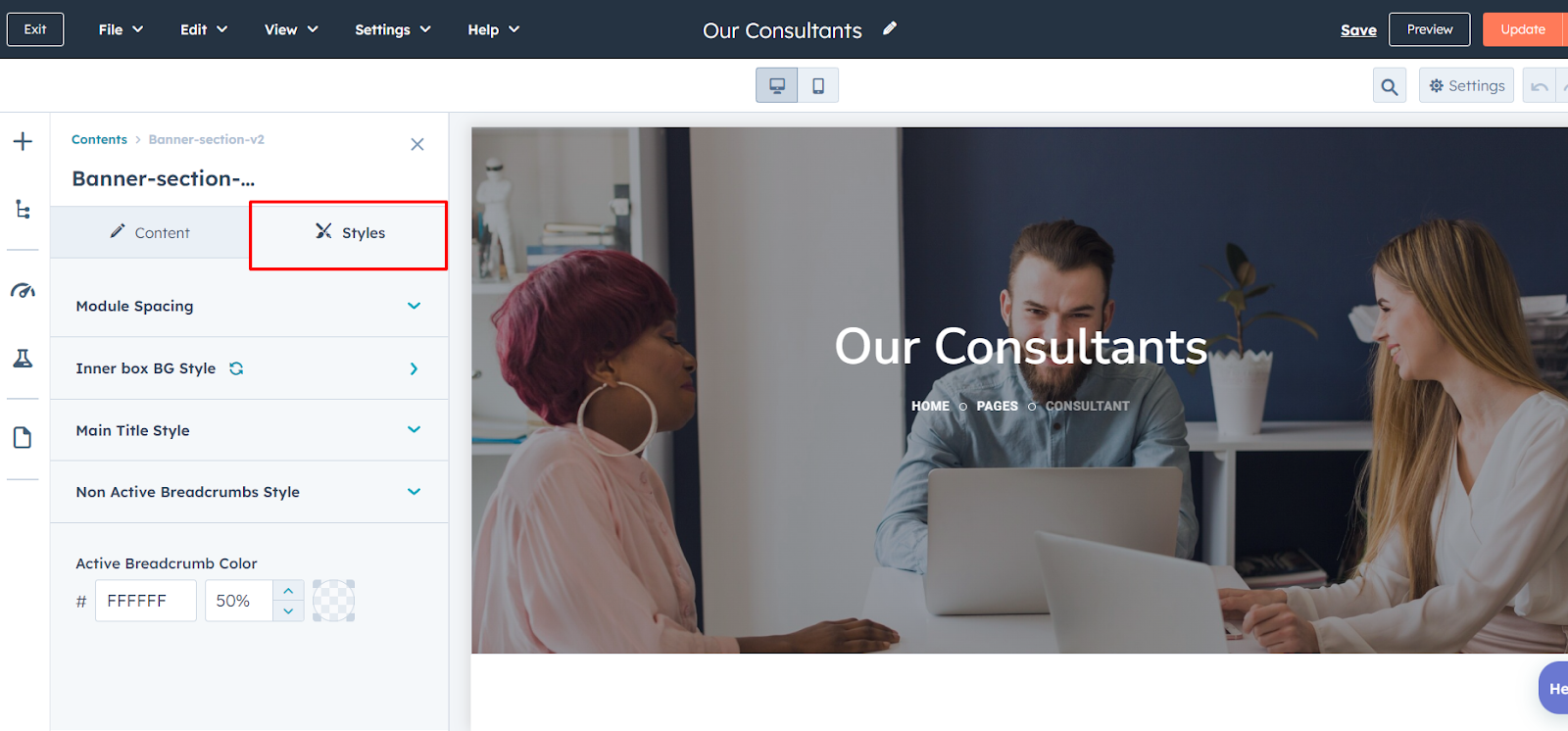
Inside the edit page of a particular page, You can just click on a module and click on the Styles tab to update the styles of each element included in the module such as fonts, color, Background, etc.
Type Of Modules
The Siloh Pro theme offers a wide range of useful modules, including Slider, Accordion, Blog Listing, Banner, Grid Cards, Marquee, Testimonial and more. With these modules, you can easily create a fabulous website. Check out the example below to see how these modules work together to build a stunning site.
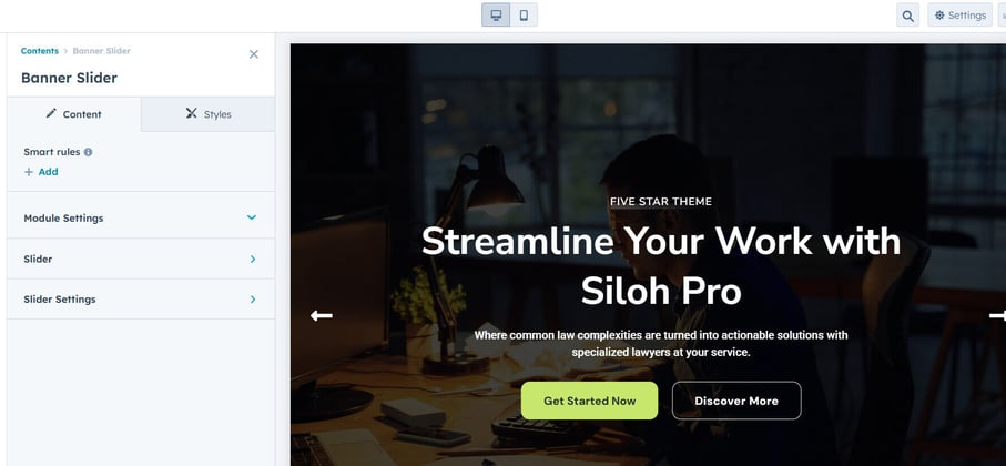
Slider
A Slider is a dynamic element that allows you to display multiple images, text, or content in a rotating or sliding format. It's a great way to showcase featured content, promotions, or key visuals in an engaging, interactive manner.
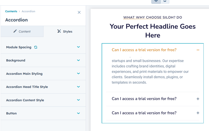
Accordion
The Accordion module allows you to create expandable and collapsible content sections, improving user experience and saving space. Ideal for FAQs, lists, or detailed content, it ensures a clean and organized layout.
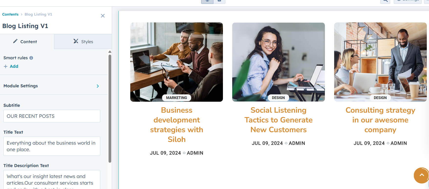
Blog Listing
The Blog Listing module displays a dynamic list of blog posts with options to filter, animation type, and paginate. It helps organize and present blog content in an engaging and user-friendly layout.
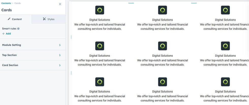
Cards
The Cards module allows you to display content in a responsive, card-style layout, perfect for showcasing products, services. It offers flexibility in design, enabling easy customization of card content and layout.
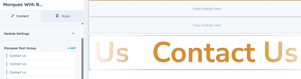
Marquee
The Marquee module creates a scrolling or sliding text effect, ideal for highlighting announcements, promotions, or news. It adds dynamic movement to your website, drawing attention to important content.
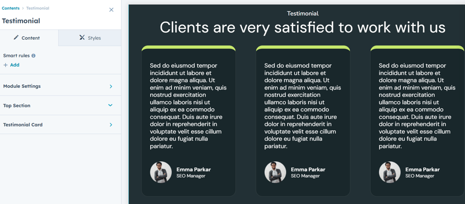
Testimonial
The Testimonial module allows you to showcase customer reviews or feedback in a visually appealing format. It helps build trust and credibility by displaying authentic experiences from clients or users.
3D Cards Effect
Interactive swipe animation with stacked cards—adds a dynamic, 3D feel to your content. Smooth and responsive, now integrated as a custom HubSpot module.

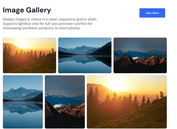
Image Gallery
Display images & videos in a clean, responsive grid or slider. Supports lightbox view for full-size previews—perfect for showcasing portfolios, products, or event photos.
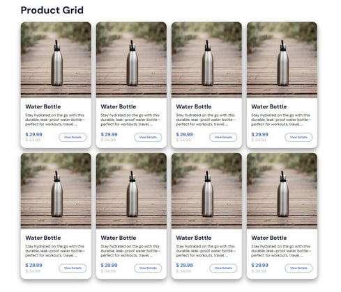
Products Card
Showcase your products with stylish, responsive cards featuring images, names, prices, and quick action buttons—ideal for boosting engagement and conversions. This module also includes layout settings to switch between slider and grid views, giving you full flexibility to match your page design and user experience needs.
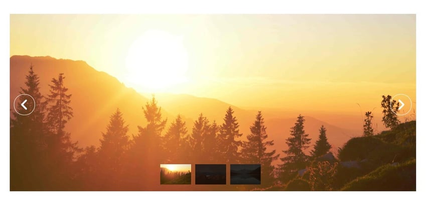
Advance Slider
Showcase your content in style with this fully responsive Slider + Carousel. Smooth transitions, swipe support, and customizable layouts make it perfect for images, testimonials, and more. Includes versatile slider options such as responsive carousel or slider modes, with pagination styles like thumbnails, scrollbar, or pagination dots for enhanced navigation and user control.
Advanced Pricing
The Pricing module enables you to present your products or service plans in a clear and structured layout. It helps customers quickly compare features, benefits, and costs, making it easier for them to choose the option that best fits their needs.

Support
For support and additional developments, feel free to reach out to the Nidish Support Team dev@nidish.com by request implementation support here.